Baltimore Quality of Life Index
Project Overview + Objective
Data Exploration + Design Iteration
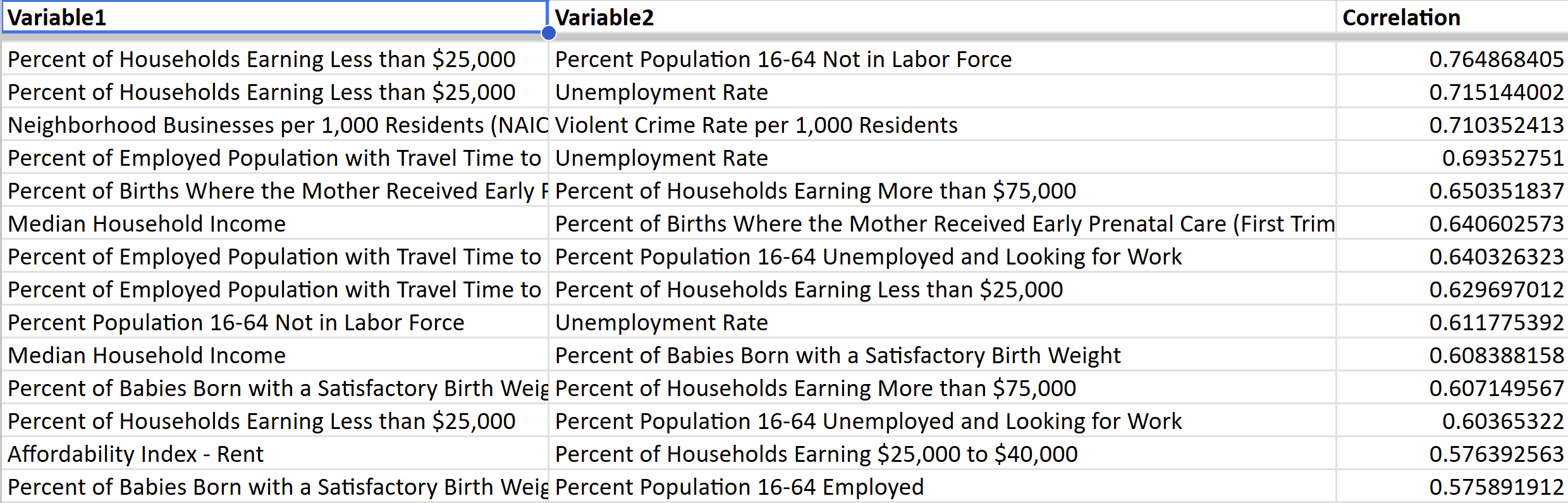
Initial data exploration involved looking through correlations between all neighborhood indicators from the BNIA database. I used R to calculate correlations and examined results in Excel. After this first pass, it was back to the drawing board. I wasn't happy with the correlation data and needed to find a different approach for analyzing and creating discourse around Baltimore neighborhood quality of life.

R script running correlations between neighborhood environmental variables.
Correlations were as expected but not compelling in regards to neighborhood relationships.
Data Exploration + Design Iteration
After some sketching and deciding on a scatterplot for the main visual, an index started to emerge as a way to plot an assigned score for each neighborhood. The six data points listed above stood out in the R correlation analysis and were what I moved forward with.
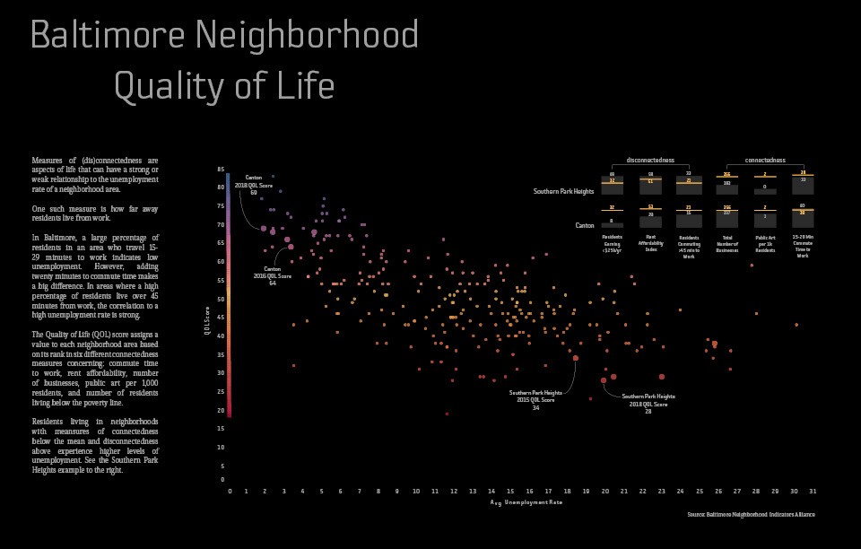
I chose these 6 indicators because a discourse around connectedness and disconnectedness started to emerge. I assigned 3 to each and plotted each neighborhood against the mean. In the visual below, Canton, is a neighborhood with a higher quality of life score. Its residents experience lower levels of disconnectedness and higher levels of connectedness (compared to the mean).

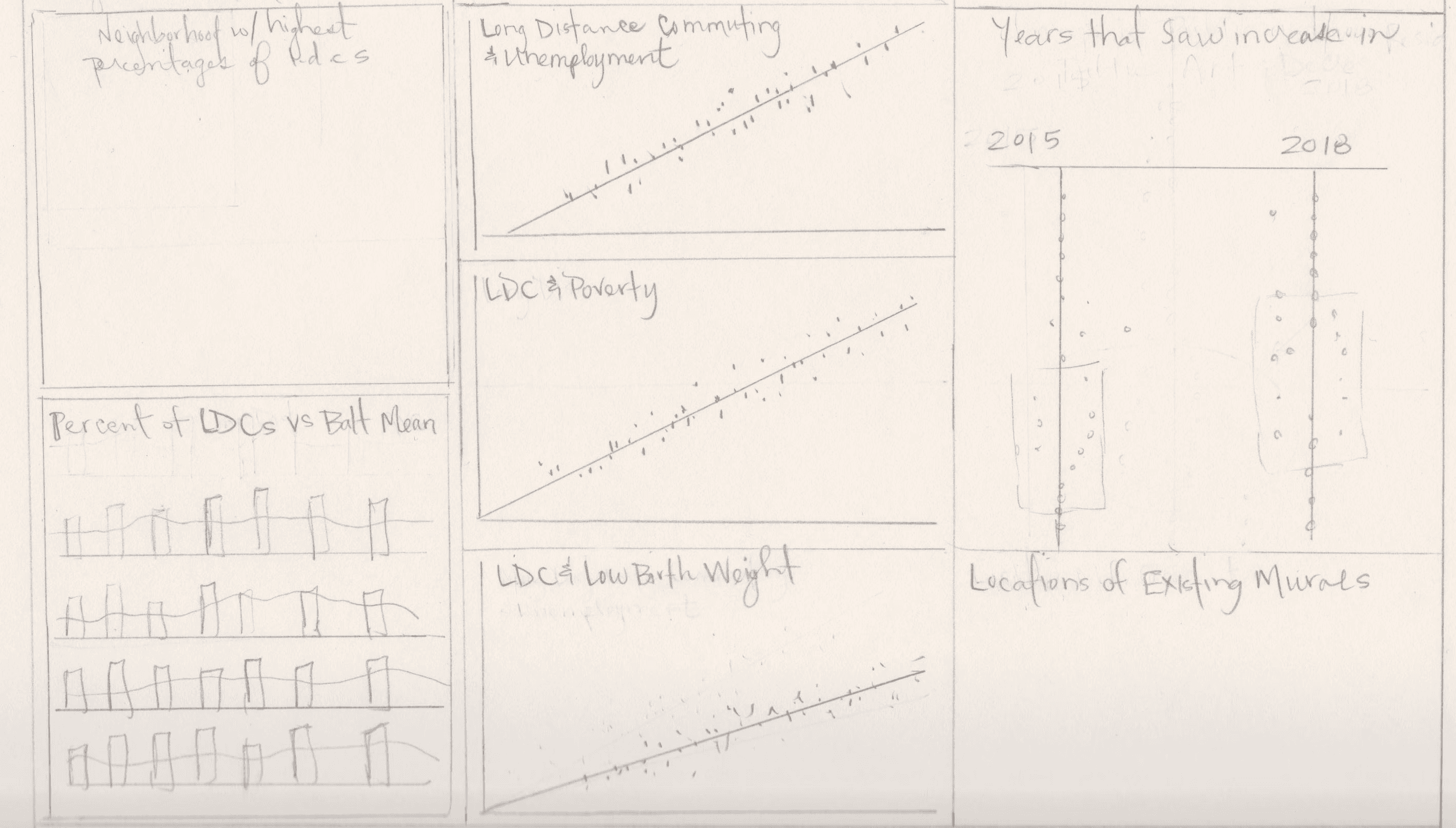
Sketching design layout and graph ideas.
After doing my initial work in Tableau, assigning neighborhood to their calculated scores, I exported the main scatter plot graph image and uploaded into Illustrator for high-touch design work on layout and color. From there, I added the stacked bar charts in the top right using Illustrator to create.

Scatterplot uploaded into Illustrator for continued design work.
Click to view final piece.