Science Studies
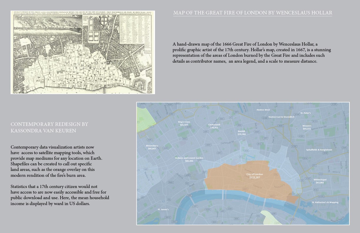
The Great Fire of London
This was a challenge project to use a historical visualization and modernize it using today's tools. I created my own shape files for Tableau was was able to recreate the area of the fire as show in Hollar's 1666 hand drawn map of the fire's destruction area. For additional insights, I layered London demographic data to understand which type of demographic this fire would effect today.
Florida Seagrass Foodwebs
These charts were made using flourish.studio. Both the Sankey graph and web diagram are interactive. Choosing the right visualization for complex relationships can be challenging. The web diagram is my preferred visual for this exercise in understanding relationships in the food web of organism living in Florida seagrass. Relationship visuals like these are akin to word clouds and are used to gain a general understanding of relationship hierarchies.

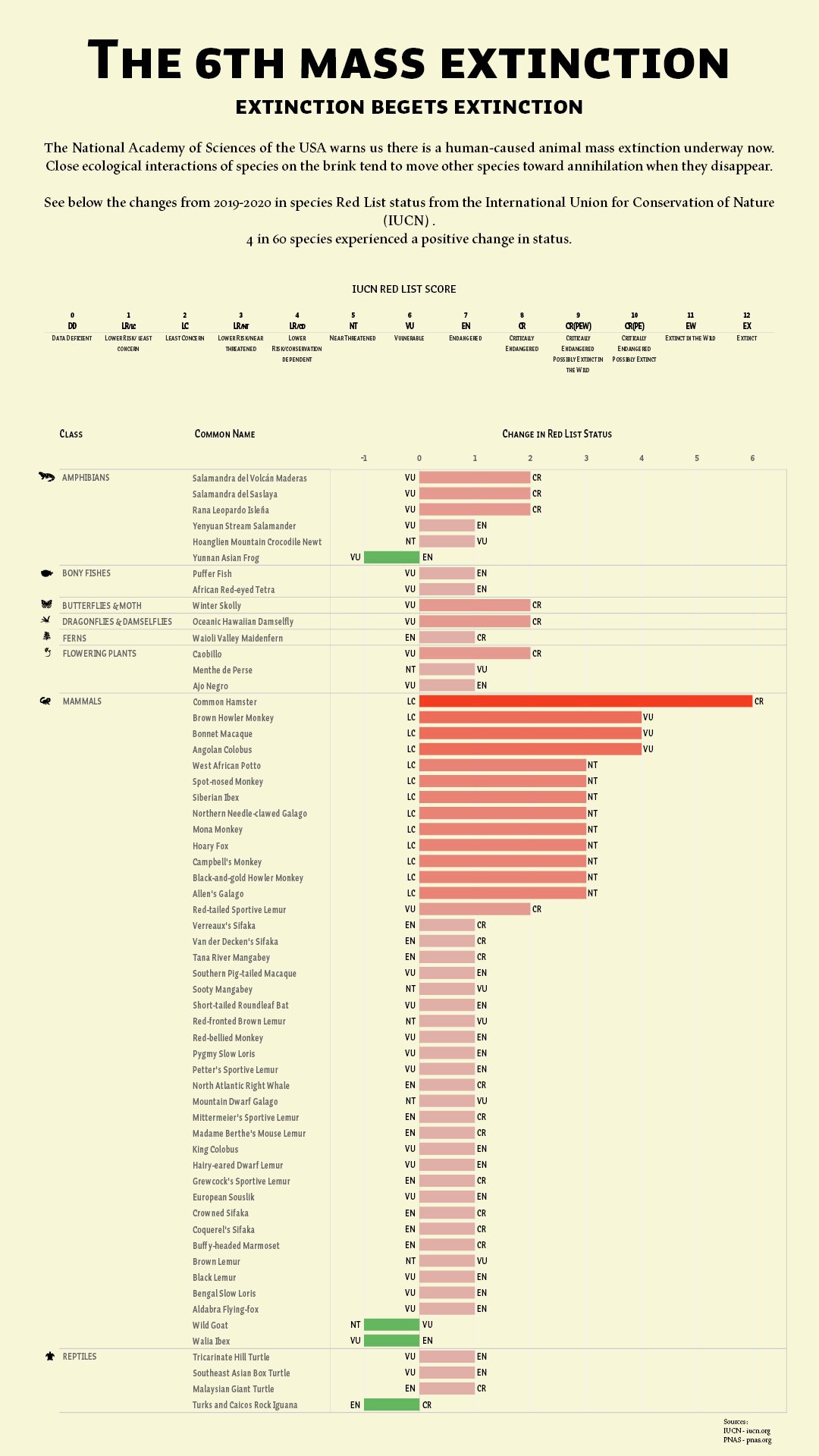
Mass Extinction Analysis
The piece below was an exercise in presenting information in a categorized, visually hierarchical layout. The horizontal bar graphs were made in Tableau and exported to Adobe InDesign for layout and visualization detailing.