Carrier Scorecard Dashboard
This dashboard was a special build for a customer wanting to track their delivery times across different timeframes and variables. Together, we worked to make sure the correct data points were coming across and the positive and negative time associates were categorized to their specifications.

Carrier Scorecard Dashboard
A UX Design Test
Designed as part of a suite of dashboards, this one took common elements of the product UI and displayed them differently. For a twist on how users view rates over time, I blended historical and today's rate with forecasted rates for one seamless timeline.
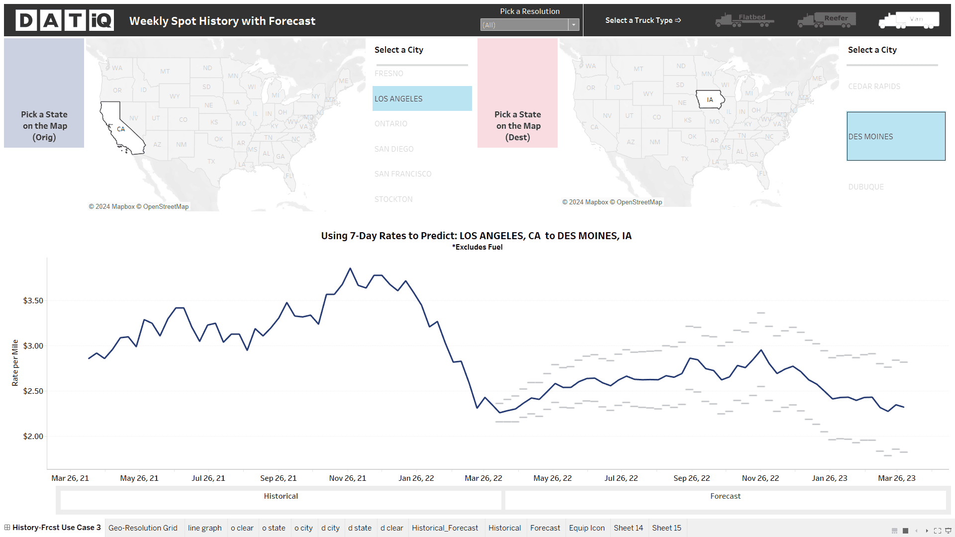
Research & development design for a new user experience.

The above design featured on the company's website.